Monday, June 25, 2012


 Today, I am going to post on Millennium Actress (2001). I like this film  because it was very touching as I could see how passion for someone will drive a person to achieve a goal. Even though the lead character Chiyoko Fujiwara never managed to meet the man of her dreams again, she  is a great actress because she put her emotions for him into acting. I found this to be very emotional and different from Paprika(2006),  which is more intellectual. Just like Paprika, Satoshi Kon, shows different levels of reality and sometimes its difficult to tell what is reality and fiction or what is past and present.
To make things more complicated, the film also involves a director, Tachibana, who is trying to make a documentary about Chiyoko Fujiwara. However, we see him in every story she tells so the flashbacks are not reliable as they have his fantasy element of him being involved in the scenes.

In the two pictures above, wee see him acting out a role while he is interviewing Chiyoko.in real life.

In all the scenes from Chiyoko's previous films,
the director always acts as the protector of Chiyoko.

The scene above is suppose to be a flashback and if u look carefully at the background you can see Tachibana's face. This is very good use of background and foreground as in the foreground Chiyoko is accompanied by the director she will marry but in the background is the person  who genuinely cares for her but she does not even notice him.


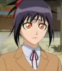
The side kick of the director, Kyoji Ida is there for comic relief. He has a few stock expressions.


Reusing similar expressions is very common in Japanese Anime. Characters who are surprised will perform an extremely exaggerated expression like the 2 instances you see above. The beads of sweat rolling down when someone is frightened is also a convention of Japanese Anime.

Another sequence that shows how past recollections can bleed into a film is when Chiyoko talks to her mother:
In the shot above Chiyoko's image is reflected in the mirror. 
The conversation continues seamlessly but Chiyoko's real life mother has been replaced by an actress while in the reflaction is the old lady who  gives her the thousand year tea which makes her unable to forget the man she loves. We first see the old lady in a film that Chiyoko is acting in but the tea seems to have an effect on her real life and in real life she never gives up on looking for the man she met when she was a child.


 In the 2 stills above Chiyoko is acting as a princess from the past. The 2 gray dots on her face are meant to represent eye brows of the aristocrats in the Sengoku period.

 
This is from a fantasy sequence when Chiyoko in real life tries to find the artist she once met. She sees a painting and  the painting starts to move and the man she is lookong for waves goodbye and walks away. He is drawn without facial features as she has forgotten what he looks like.
 The still to the left is from the end of the film showing that Chiyoko who is dying in real life is actually going to space to look for the man again. Just like the plot line of the thousand year tea in her film, Chiyoko appears to really want to spend many life times looking for him.


 I read that this film was actually based on the life of Setsuko Hara, who was born in 1920,  a Japanese actress who retired suddenly and lead a reclusive life and is still living a reclusive life. The art of this film is not as complex as Paprika  and seems completely hand drawn with no CGI effects this is appropriate for the film because the story is a simple love story which spends the ages of not only time but reality. If there had been  too much special effects the emotions would not be that strong. In my previous post i wrote about Final Fantasy: The Spirits Within(2001) which came out i nthe same year as Millennium Actress(2001), Even though Final Fantasy had state of the art animation then, the CGI could not convey the emotions that Satoshi Kon did with his hand drawn characters. This is why I prefer Millennium Actress should not be technically good but emotionally supportive.

Monday, June 11, 2012


 Final Fantasy: The Spirits Within ( 2001) (Original title: Gaia)
was a ground breaking animation film even though now the graphics would look a bit dated it was the first attempt to make a photorealistic rendered 3D featured films. Unfortunately,  thought it cost 137 million to make it only gained 85 million dolalrs world wide. (http://finalfantasy.wikia.com/wiki/Final_Fantasy:_The_Spirits_Within). The plot is not fantastic but the ups and downs in the character's emotions were complemented by the music and graphics. I want to share about the amount of effort that was put into this film.


In the photo below, the animators used 80000 particles of dust for that scene to evoke a desolate world.


Original storyboard of Aki floating out of her chair:


Sketch of  Aki in the opening scene
:


Screenshot of Final Scene:


 Thought the shot above might look very simple a lot of time was taken to get every detail right. The lighting, the hair, and how she will float out of the chair later were all discussed in detail.


Motion-capture


The still above is from the documentary: The Making of Final Fantasy. Motion capture was quite a new technology at that time. With motion capture you can map human motion onto the motion of a computer animated character. However, motion capture can lack the individuallity of hand animated characters. The animators also hand keyed the hands since some subtleties are hard to achieve.
 The animators look into a mirror to see what exactly happens when an action is performed. For example when you swallow, you blink and your throat goes up.

The animators went scuba diving to see how the bubbles in the water would look like when someone falls into the water.
 Animator:

 Final Character:


Some of the rocks were hand animated while some used dynamics simulation:


Lighting
 
For a darker, more intense mood, the lighting has to match the atmosphere. Whether it was indoors or out in the barren landscape, the lead lighting artist has to make sure the lighting is not too cheery or happy. At the beginning, there’s a lot of blue light. A lot of the key/primary lights were from a practical source. The love scene was hard to light as there was a high contrast light from the space window and the fill light had to be very soft so as to create a mysterious, romantic setting:


Compositing

The artist had to sketch several suns for the director, Hironobu Sakaguchi, as this key scene was repeated several times in the film that was about protecting the planet from alien forces.


 Texture mapping was used on the sun:


Before compositing, they had to do a lot of rendering and in compositing they would take the layers they have rendered and put it together one by one. In the shot below of Aki standing on a platform, they had to render the platform, the bar, the background, the dust and fog, Aki’s light separately before compositing. In the background, there were billboards (which they photographed from Times Square) before changing:


 Sound

Unlike a live action film where some of the sound is recorded live on set. In an animated film, sound is built from scratch and is only limited by technology and the imagination. The sound designer used a combination of animal sounds such as tigers, lion and bears for the imaginary creatures.
The London Symphony Orchestra performed the score and it was recorded. Low brass music and Japanese drums were used when the scenes were more violent. In the scene when Aki talks about the death of a little girl, the music composer used a piano to express the feeling of home since a lot of people took piano lessons so the sound of the piano conveys a sense of familiarity.  

 This DVD has one of the most comprehensive of special features that I have ever seen ( I think they really need to recoup their loss.) The last image I want to share is the real life inspiration for Aki. Even though the film was not very successful, Aki Ross was very well designed and she was even the first animated woman to be make the list of Maxim's sexiest woman ever.


Aki's voice actress Ming Na:


Friday, June 8, 2012


Today, I am going to write about Japanese Anime. My favourite anime series are Zero No Tsukaima and Bleach. The slight element of romance made the Anime seem more colourful or else the Anime would just be hack and slash. The Bleach anime series started in 2004 and ended recently in march 2012. It has been very popular despite the fact that the animation used is not very advanced. In fact the animation is quite limited. In many scenes, only one feature such as the eyes or mouth of the character will move while the rest of the scene will be stagnant. This use of limited animation is a process of making animated cartoons that does not redraw entire frames but reuse, common parts between frames. The Bosko cartoons in the 1930s made use of this technique in order to save time and money. Keep your eyes on the video below. Watch out for the looping background when Bosko starts moving on his cart. From 1.45mins onwards,  even though Bosko is moving forward, the background is reused over and over again.


Osama Tezuka also used this technique for Astro Boy. However, I think that the fans of the anime series don't mind because I think it adds to the style of the Anime which makes it comical at times. There are some hallmarks of Japanese Animation that Bleach utilises such as the use of question marks when the characters are confused, or fixed funny faces which each character has a repertoire of. In this way it is very different from animation such as Spirited Away or Paprika which have characters which behave in a more realistic manner. The animation for Bleach is less detailed than the Hayao Miyazaki or Satoshi Kon productions.  This is probably because the television series has less budget and the  standard of animation in-terms of  detail is lower, so  to keep the look consistent and the budget low the movie also has a lot of sequences where the main characters are moving but the extras are stagnant looking like they are still in a comic book.

The picture below shows the crowd as faceless people. They are drawn very simply and when Senna is moving while walking on the tight rope, they are motionless. Note also how the background is blurry and all the focus is on Senna who is a new character introduced in the movie.


In the close up below, you can see how simply drawn she is but yet we can associate with her because her emotions are written on her face. Her amber coloured eyes also make her stand out from the other characters and made her appear more mysterious. This is appropriate because in the plot she is a Shinenju which is composed of the memeories of dead souls and  is the weapon that the antagonists want to use to destroy the world. ( Which by them way is a lame plot. Why do villains keep wanting the destroy the world?)

 Bleach is successful because by focusing on the facial expressions and the special moves of the main characters, the audience feels more attracted to the character. The picture below is a scene from the ending just before Senna is about to disappear. And the main character Ichigo is carrying her and he lied to her that the name on the grave is hers whereas it actually belongs to someone whose memories Senna has retained. Even though the background elements are not well defined, the dull colours help to evoke the sadness of the scene. The characters are also placed at the center of the frame so that the focus is on them. The


I also like Bleach because of the effects of the attacks each character does.

This Video below shows the bankai of each different character. Each character has their own unique bankai which is very popular with the audience because it adds to their distinctive personalities. Each of them has a sword which can change once their users unleash their 2nd stance of their sword. Only the higher ranking officials in the Bleach can unleash their bankai. It is usually animated in a very exaggerated manner with lots of glowing lights and makes the character appear very powerful.


Japanese Anime is popular all over the world due to the characters being able to connect emotionally with the audience.  The characters have inspired countless cosplayers who want to someone else. This shows that animation does not need to be realistic or very detailed to capture the imagination, plot and characterisation are what draws and enthralls the audience.


A Cosplayer dressing up as Grimmjow.


Friday, June 1, 2012


Today I will be talking about RATATOUILLE, an animation feature from Pixar. The main character is a young rat called Remy whose dream was to becoming a famous French chief. I think the characterisation of Remy was very important to the film as they had to make a rat endearing and intelligent looking so that the the audience would believe that he could cook. The made Remy look scruffy to make it believable that he is a street rat who was not rich.  Remy also had humanised actions such as standing on two feet and using his hand to hold a pan and he is also shown to be reading.

In the image below, Gusteau is drawn as a flat character so that he will look like an image in a book and this contrast with the back view of Remy which appears more life like. The food on the right page is also drawn in a flattened manner so they would look like images in a Recipe book.


In this scene below, Remy and his father, Django, are having an argument. This looks very much like the human behaviour of a child and his father quarreling. Django is showing authority by pointing a forefinger and staring down at his son. Remy is showing a defiant attitude by sticking his head out and clenching his fist into a ball.


The screenshot below, shows some of  the characters in the restaurant with prominent and big exaggerated noses. The seven characters have distinguishing features which differentiate them from each other. The first from the left has buck teeth, the second guy has a manicured mustache, the third person has a double chin while Colette has light make up such as lipstick on. The guy to Collette's right has a square jaw while the guy behind him has a protruding jaw and the man of African descent has the most elongated face and  his uniform is stained.


 The screenshot below is of the key scene where, Anton Ego, a food critic is just about to taste the key dish of this film - ratatouille.


I read from  http://www.comingsoon.net/news/movienews.php?id=19939 that the top American chief  Thomas Keller was hired to design this dish. As food is so important to this movie the animators had to go through cooking classes so as to learn more about how food textures and restaurant kitchens work. To give the food more realism, the animators used a sub-surface light scattering technique on fruits and vegetables. Adria Ferran was also hired as a food consultant and he lent his voice to the Spanish version of the film.


Other than realistic portrayal of the food, the deliciousness of the food is also conveyed through the character's facial expressions.  

Screenshot before Anton Ego comes for the food tasting. Notice how his lips are in an unattractive dull colour and his complexion is almost white as though he is a corpse.He is also shown sneering.


First Bite

Reaction

In the first picture, Anton's complexion had less colour as he has been show through the film which makes him appear cold and unapproachable.
In the second picture, his face has a pink glow and it seems that the lamp on the table is illuminating him more. His lips are also healthy red. He appears more likable. This helps the plot because the film ends with him helping Colette, Remy and Linguini start a restaurant.


All in all, Ratatouille is a very family orientated film that is heart-warming and enjoyable. Pixar infused the movie with warm glows to convey a cosy atmosphere making audience want to believe in and live in the world.